Set Up Your Brand System in Claude Design So Colors, Typography, and Styles Apply Automatically
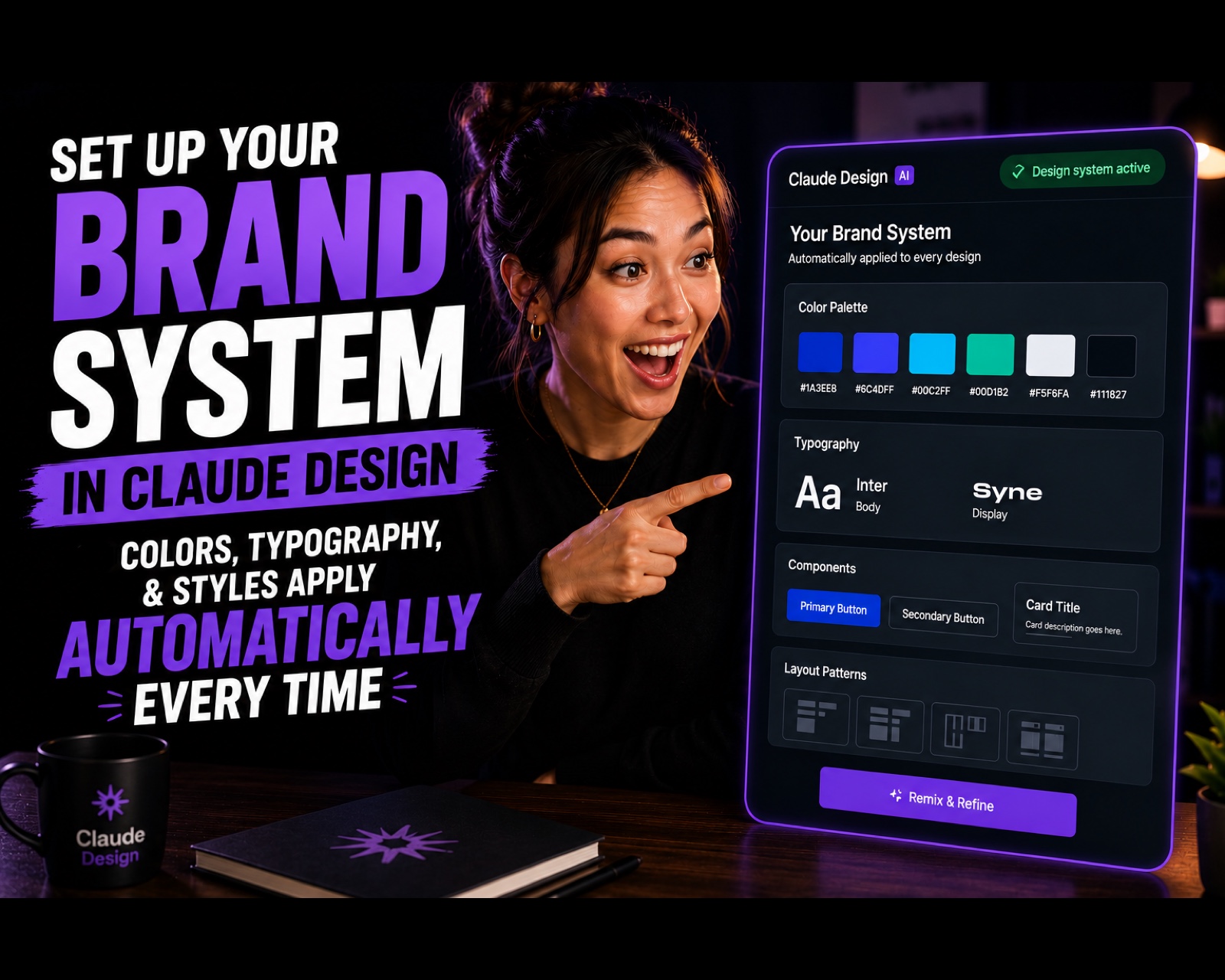
Claude Design
By the end of this guide, you'll have uploaded your brand assets to Claude Design and extracted a persistent design system — so every output automatically uses your correct colors, typography, and component styles, with no manual enforcement.
Who This Is For
• Brand managers and designers tired of correcting off-brand colors and fonts in AI-generated outputs • Agency teams where every designer makes slightly different choices on spacing, buttons, and typography
• Founders who want every prototype, deck, and one-pager to look like it came from the same designer
• Anyone using Claude Design who hasn't set up their brand system yet
What a Design System in Claude Design Does
Once set up, Claude Design extracts and stores four things from your brand assets:
1. Color palette — primary, secondary, and accent colors
2. Typography — font families, sizes, and weights
3. Components — buttons, cards, navigation elements, and other UI patterns
4. Layout patterns — spacing rules, grid systems, page structures
Every design output Claude generates from that point forward applies your system by default. On Team and Enterprise plans, it applies across all team members' projects automatically — no one has to remember to apply brand guidelines, because the system does it.
What You'll Need
• A Claude Design account (claude.ai/design)
• Your brand assets — any combination of:
• Existing web pages or screenshots
• Component libraries or codebases (e.g., React component files)
• Design prototypes or Figma exports
• Slide decks or PDFs
• Logos and color palette files
Tip from Anthropic's docs: Include real finished examples, not just spec documents. A completed page tells Claude more about your brand's feel than a style guide alone.
Brand System Setup Prompt
I'm setting up a persistent brand system in Claude Design so every output — pages, components, and copy — automatically stays on-brand without me manually correcting colors, fonts, or spacing every time. Help me do this step by step:

1. I'll upload our brand assets first (logo files, brand guideline PDF, and 2-3 example designs we consider "on brand"). Tell me exactly what file types and how many examples you need to reliably extract a design system from them.

2. From those assets, define a complete design system: primary/secondary/accent color palette (with hex codes), typography scale (headings, body, captions — font family, weight, size), spacing/grid rules, and component styles (buttons, cards, inputs) — presented as a single reference sheet.

3. Flag anything inconsistent in the assets I gave you (e.g., two slightly different blues, mismatched heading fonts) and recommend which version to standardize on.

4. Save this design system as a persistent style so I don't have to re-upload or re-explain it in future sessions — confirm how you're storing it and how I invoke it going forward.

5. Generate one sample output (a landing page section or social template) using only this saved system, so I can verify colors, typography, and component styles are being applied automatically and correctly before I roll it out to my full team.

Our brand context: [describe your industry, brand personality in 2-3 words, and who typically deviates from brand — e.g., "multiple freelance designers," "an in-house team," "AI-generated drafts"].